by Bruce Mitchell
Durham, NC
Representational
I make paintings of vehicles, commercial signs, street signs, telephone poles,
and similar elements of our built environment partly because these are
so ubiquitous and familiar that we tend to take their presence for granted
even though we depend on them in our day-to-day lives. Signs guide us
to our destinations or indicate where we can obtain necessities such as
food, energy, and lodging, while the core infrastructure represented by
telephone poles makes possible the online world on which we have come
to depend.
To me, these images are rich in allusions and metaphors relating to our civilization and the connections between us, including our cultural and industrial history. That said, I do not necessarily seek to comment on our way of life through these paintings. My own primary interest is more painterly. Regardless of the proximate subject, my paintings are explorations of the relationships between light and shadow, figure and ground, color and space. Ultimately, I seek to produce paintings capable of evoking an emotional response, and all the underlying allusions and metaphors are there to support that aim.
Most of the older telephone pole paintings you see here were made standing on the lawn in front of the building I lived in at 810 Farmington Ave. in West Hartford, CT. Many of the cloud studies and some of the telephone poles were painted alla prima (that is, started and finished in one session). Most represent what I was seeing in the sky at the time.
The actual telephone poles are the ones along what was my street when I lived in West Hartford. Hence the titles, such as West of 810 Farmington Ave., At 810 Farmington Ave., and East of 810 Farmington Ave.
Why paint skies and telephone poles? I'm really not interested in painting the office building across the street, the Chinese restaurant, or the flower garden in the front yard. I am always looking at the sky - it's a show of beauty that changes constantly and never gets old. It's always there, no matter where you go. I do see a lot of things up there that I could never paint because they simply wouldn't be believable on canvas. But there's still plenty to work with most days.

As for the telephone poles, each has its own unique personality. They come in an endless variety of crossbeam configurations, with different types and sizes of insulators, turnbuckles, transformers, streetlights, footpegs for the linemen, coils of coaxial cable, and mysterious devices whose purpose is unknown to me. Moreover, they present interesting technical challenges to me as a painter and enable me to capture a wide variety of moods through the use of light and shadow, color and tone.

Abstract
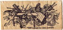
The abstract paintings on this site are from a series I've been working on since the mid-'90s. There are stylistic precursors that date back to the early '80s, most notably the hundreds of drawings I made on paper napkins throughout that decade and into the '90s.
Also notable is a series of paintings made between about 1982 and 1988 that featured various objects in midair. These included cars painted in photorealistic detail against painterly skies, and household objects such as hammers, knives, flashlights, and the like painted against spacially ambiguous backgrounds. A good example of the latter would be "Bad Table," now in the Feldman collection. It features an overturned coffee table and a collection of identifiable and not-so-identifiable objects apparently hurtling through space.
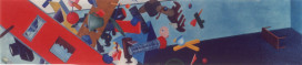
Around 1995, the style of older paintings such as "Bad Table" combined with the vocabulary of forms developed in the napkin drawings to initiate an ongoing series of abstract paintings represented on this site. The first such painting is an untitled piece, now in the Zlody collection, but I don't have a picture of that one to include here.
As you can see, the coloring of the forms in these newer paintings is solid (that is, there's no shading to suggest 3-dimensional objects), although I sometimes fool around with chiaroscuro in the backgrounds. Thus, any illusion of depth comes only from the colors, the shapes themselves, and their relationship to each other and to the background. Because some forms overlap others, they seem to be in front of or behind each other, forming some depth in the picture plane. But this depth is both illusory and ambiguous.
I like to think there is some originality in these. Clearly there are influences, too, which are diverse and numerous. The palette, for example, is informed as much by Colorforms® as by Josef Albers, while the forms betray knowledge of modern painters such as Stuart Davis and Jackson Pollock. Not that I'm consciously trying to incorporate these influences. Nevertheless, that which appeals to me or interests me inevitably affects my work.
The central themes in these paintings are ambiguity and play. The forms
have no overt models in the real world, yet they frequently resemble
things like amoebas and eyeballs, as one reviewer
noted. The absence of real-world references also introduces ambiguity
about scale; the forms could be any size from microscopic to gigantic.
The viewer is drawn in by the lively colors, then engages in puzzling
over what the forms might represent, the scale of the forms, and depth
of the picture plane. In this way, the fun of making these paintings
is shared with the viewer.